CSS速查
此笔记不包含CSS基础部分。
选择器
| 选择器 | 说明 |
|---|---|
| 通配选择器 | 使用*表示,一般使用此选择器重新设定页面的边距*{margin:0;padding:0} |
| 元素选择器 | 直接使用元素的标签名称即可p{} |
| ID选择器 | 使用“#”号,会选中对应id属性的元素#id{} |
| 类选择器 | 使用.号,会选择对应class属性的元素.class{} |
| 群组选择器 | 就是将多个具有相同样式的选择器放在一起,用英文逗号隔开p,div |
层次选择器
| 选择器 | 说明 |
|---|---|
| 包含选择器 | 用空格隔开,效果是选择内部所有子元素和子元素的子元素(一直向下查找) 如 div p.c1意为选择div下class属性为c1的p标签 |
| 子选择器 | 使用大于号,效果是只选择子元素,不会选择孙子元素 |
| 兄弟选择器 | 使用“~”号意为选择所有下方子元素 使用“+”号意为选择第一个下方子元素 |
属性选择器
| 选择器 | 说明 |
|---|---|
| [attribute] | 选取带有指定属性的元素 |
| [attribute^=value] | 选取属性值以指定值开头的元素 |
| [attribute$=value] | 选取属性值以指定值结尾的元素 |
结构性伪类选择器
| 选择器 | 说明 |
|---|---|
| :root | 匹配文档的根元素 |
| :nth-child(n) | 匹配其父元素的第n个子元素 |
| :nth-last-child(n) | 匹配其父元素的倒数第n个子元素 |
| :first-child | 匹配其父元素的第一个子元素 |
| :last-child | 匹配其父元素的最后一个子元素 |
否定伪类选择器
| 选择器 | 说明 |
|---|---|
| :not | 用于过滤符合条件的元素 如p:not(#box)就是过滤掉id为box的元素 |
动态伪类选择器
| 选择器 | 说明 |
|---|---|
| :before | 在元素前面增加内容 |
| :after | 在元素后面增加内容 |
在CSS样式内使用content属性指定内容。可选的内容类别如下:
与内容相关:
h1:before {
    content: "[h1]";
}

h1:after {
    content: "[h1结束]";
}
插入图片:
h2:before {
    content: url("img.png");
}
和类或id选择器配合使用:
p.part:after {
    content: url("img.png");
}
配合quotes属性执行插入:
p.quotes {
    /*前面的是open-quote,后面的是close-quote*/
    quotes: "[这是前面的]" "[这是后面的]";
}
p.quotes:before {
    content: open-quote;
}
p.quotes:after {
    content: close-quote;
}
使用count-increment实现自动编号:
ul.ul1 li {
    list-style: none;
    counter-increment: count1; /*在这里声明变量*/
}
ul.ul1 li:before {
    content: counter(count1) "."; /*再在这里指定编号的样式*/
}
使用自定义编号:
若我们不喜欢CSS默认的编号样式(数字),我们就可以自己编写编号。
我们通过counter(name,list-style-type)用法实现使用自定义编号,name是计数器的名字,后面的参数指定编号的样式。
它的一部分取值如下:decimal-默认值,阿拉伯数字 disc-实心圆 circle-空心圆 square-实心方块。
lower-roman-小写罗马数字 upper-roman-大写罗马数字 lower-alpha-小写字母 upper-alpha-大写字母。
ul.ul2 li {
    list-style: none;
    counter-increment: count2;
}
ul.ul2 li:before {
    content: counter(count2, lower-alpha) ".";
}
多级编号
h2.ul3 {
    counter-increment: count3;
    counter-reset: count4; /*若想重新设置编号,需要在此编号的上一级添加该条语句,后面的值是要重设的编号*/
}
h3.ul3 {
    counter-increment: count4;
}
h2.ul3:before {
    content: counter(count3) ".";
}
h3.ul3:before {
    content: counter(count3) "." counter(count4);
}
完整代码:
<!DOCTYPE html>
<html lang="en">
<head>
    <meta charset="UTF-8">
    <title>动态伪类选择器</title>
    <style>
        /*与内容相关的属性*/
        h1:before {
            content: "[h1]";
        }

        h1:after {
            content: "[h1结束]";
        }

        /*插入图片*/
        h2:before {
            content: url("img.png");
        }

        /*只插入部分元素*/
        p.part:after {
            content: url("img.png");
        }

        /*配合quotes属性执行插入*/
        p.quotes {
            /*前面的是open-quote,后面的是close-quote*/
            quotes: "[这是前面的]" "[这是后面的]";
        }

        p.quotes:before {
            content: open-quote;
        }

        p.quotes:after {
            content: close-quote;
        }

        /*使用counter-increment实现自动编号*/
        ul.ul1 li {
            list-style: none;
            counter-increment: count1; /*在这里声明变量*/
        }

        ul.ul1 li:before {
            content: counter(count1) "."; /*再在这里指定编号的样式*/
        }

        /*使用自定义编号*/
        /*若我们不喜欢CSS默认的编号样式(数字),我们就可以自己编写编号*/
        /*我们通过counter(name,list-style-type)用法实现使用自定义编号,name是计数器的名字,后面的参数指定编号的样式*/
        /*它的一部分取值如下:decimal-默认值,阿拉伯数字  disc-实心圆  circle-空心圆  square-实心方块*/
        /*lower-roman-小写罗马数字 upper-roman-大写罗马数字 lower-alpha-小写字母 upper-alpha-大写字母*/
        ul.ul2 li {
            list-style: none;
            counter-increment: count2;
        }

        ul.ul2 li:before {
            content: counter(count2, lower-alpha) ".";
        }

        /*多级编号*/
        h2.ul3 {
            counter-increment: count3;
            counter-reset: count4; /*若想重新设置编号,需要在此编号的上一级添加该条语句,后面的值是要重设的编号*/
        }

        h3.ul3 {
            counter-increment: count4;
        }

        h2.ul3:before {
            content: counter(count3) ".";
        }

        h3.ul3:before {
            content: counter(count3) "." counter(count4);
        }
    </style>
</head>
<body>
<!--与内容相关的属性-->
<h1>一级标题</h1>
<hr>
<!--插入图像-->
<h2>二级标题</h2>
<hr>
<!--只选择部分元素-->
<p class="part">第一</p>
<p>第二</p>
<p>第三</p>
<hr>
<!--使用quotes属性-->
<p class="quotes">使用quotes属性</p>
<hr>
<!--配合counter-increment属性添加编号-->
<ul class="ul1">
    <li>第一条</li>
    <li>第二条</li>
    <li>第三条</li>
</ul>
<hr>
<!--自定义编号-->
<ul class="ul2">
    <li>第一条</li>
    <li>第二条</li>
    <li>第三条</li>
</ul>
<hr>
<!--多级编号-->
<h2 class="ul3">标题</h2>
<h3 class="ul3">子标题</h3>
<h3 class="ul3">子标题</h3>
<h2 class="ul3">标题</h2>
<h3 class="ul3">子标题</h3>
<h3 class="ul3">子标题</h3>
<h2 class="ul3">标题</h2>
<h3 class="ul3">子标题</h3>
<h3 class="ul3">子标题</h3>
</body>
</html>
UI元素状态伪类选择器
hover设置鼠标悬停时的样式、:focus设置获得焦点或进行输入时的样式、:active为点按不松开时的样式,它们三个顺序不能颠倒。
input[type="button"].e1:hover {
    background-color: pink;
}

input[type="button"].e1:focus {
    background-color: yellow;
}

input[type="button"].e1:active {
    background-color: red;
}
:checked设置复选框选中时的样式。
input[type="checkbox"].e2:checked {
    outline: red 2px solid; /*绘制于复选框周围的线*/
}
:selection设置文字选中时的样式。
p.e3::selection {
    background-color: #f00;
    color: #0f0;
}
使用CSS美化文字
网页字体颜色用color属性设置。
使用text-align设置文本的水平对齐方式,可选值为left、center、right、justify和inherit。
使用vertical-align设置垂直对齐方式。
首行缩进用text-indent、文本间距用letter-spacing、单词间距用word-spacing。
line-height用于设置文本的行间距,它的取值可以是百分比、浮点数或单位标识符,允许为负。
属性值font-weight用于设置字体粗细,其有13个值:bold:定义粗体字体、bolder:定义更粗的字体,相对值、lighter:定义更细的字体,相对值、normal:默认值,标准字体、还有100~900之间的值,分别代表不同的粗细程度。
font-size用于设定字体的大小,可以指定像素值、还可设置参数:larger:相对于父元素的字体大小进行增大,使用em单位计算、smaller:相对于父元素的字体大小进行减小,使用em单位计算、length:百分比或浮点数和单位标识符组陈大哥长度值,不能是负数,百分比取值是基于父元素中字体的尺寸。
font-style用于设定字体的风格,有四个属性值:normal:默认值、oblique:斜体、italic:斜体、inherit:从父元素继承。
font-family用于设定字体,如隶书、宋体等。
可以将字体的粗细、斜体、大小、字体等整合为一个,用font属性表示。排列顺序是font-style、font-variant、font-weight、font-size和font-family。font-family有多个值时,需要用逗号隔开,前三个可以自由调换或不写,后两个不可以调换且必须出现。
使用服务器字体:
/*首先要定义服务器字体,语法如下*/
@font-face {
    font-family: blazed;
    src: url("Blazed.ttf") format("OpenType");
}

/*然后再在选择器中使用字体*/
p.p1 {
    text-align: center;
    font-size: 50px;
    font-family: blazed;
}
使用客户端字体:
/*在使用@font-face定义字体时,可以在font-family属性的第一个加上local(name)以优先使用本地字体*/
@font-face {
    font-family: name;
    src: local("宋体");
}
使用CSS美化列表
- list-style设为none可以去除自带的项目符号。
- 使用list-style-image属性可以将项目符号换成任意图片。
使用CSS美化图片
border属性用于设置图片边框,语法为“border: width color style”。其中style可选值如下:dotted - 定义点线边框,dashed - 定义虚线边框,solid - 定义实线边框,none - 定义无边框,hidden - 定义隐藏边框。
使用opacity设置图像不透明度。
使用border-radius设置图像的圆角属性。它可以设置4个值,设置一个值时表示4个角圆角相同。
box-shadow用于设置阴影图像,代码:“box-shadow:X,Y,blur,color”。X、Y表示阴影在水平方向和垂直方向的位移,blur表示模糊半径,color表示阴影的颜色。
vertical-align设置图像和文字的对齐方式。它有如下属性值:baseline:默认值,元素放在父元素的基线上、sub:垂直对齐文本的下标、super:垂直对齐文本的上标、top:把元素的顶端和行中最高元素的顶端对齐、text-top:把元素的顶端和父元素字体的顶端对齐、middle:把此元素放在父元素的中部、bottom:把元素的底端与行中最低元素的底端对齐。
background-image用于设置背景图,语法为“background-image: url("src")。
background-repeat用于设置背景图是否平铺:repeat:水平、竖直方向都平铺、no-repeat:不平铺、repeat-x:背景图水平方向平铺、repeat-y:背景图竖直方向平铺。
线性渐变:语法为“linear-gradient(方向,颜色1,位置1,颜色2,位置2,...),方向只要设置起始位置,如top表示从上到下,right表示从右到左,top right表示从右上到左下,对于Chrome、Safari、Firebox浏览器,要将linear-gradient换为-webkit-linear-gradient,对于IE9+,要换成-ms-linear-gradient。
使用background-color设置背景颜色。
使用网页动画效果
要创建动画,首先要了解@keyframes规则。创建动画和设置关键帧的语法如下:
@keyframes (动画名) {
   开始帧: 0%或者from{动画开始的样式}
   50%{50%的样式}
   结束帧:100%或者to{结束时的样式}
}
接下来就是设置动画属性,首先通过animation绑定一个选择器,并至少指定animation-name(动画名称)、animation-time(动画时间)。
- animation-name 指定动画名称
- animation-duration 指定动画播放一遍的时间,默认是0
- animation-delay 指定动画开始时的延迟时间,默认是0
- animation-interation-count 指定动画播放的遍数,取值为数值或者为infinite
- animation-direction 指定动画的播放方向,默认是normal,reverse有方向
- animation-timing-function 指定动画的速度曲线,默认ease缓动
- animation-play-state 指定动画的运行或暂停,默认是running
- animation-fill-mode 指定当动画不播放时,元素的样式。通过将animation-fill-mode设置为forwards、backwards和both将元素最终状态设置为动画的起始或结束状态
示例代码:
<!DOCTYPE html>
<html lang="en">
<head>
    <meta charset="UTF-8">
    <title>关键帧</title>
    <style>
        /*要创建动画,首先要了解@keyframes规则。创建动画和设置关键帧的语法如下*/
        /* @keyframes (动画名) {
           开始帧: 0%或者from{动画开始的样式}
           50%{50%的样式}
           结束帧:100%或者to{结束时的样式}
        }  */
        /*接下来就是设置动画属性,首先通过animation绑定一个选择器,并至少指定animation-name(动画名称)、animation-time(动画时间)*/
        /*animation-name	指定动画名称
        animation-duration	指定动画播放一遍的时间,默认是0
        animation-delay	指定动画开始时的延迟时间,默认是0
        animation-interation-count	指定动画播放的遍数,取值为数值或者为infinite
        animation-direction	指定动画的播放方向,默认是normal,reverse有方向
        animation-timing-function	指定动画的速度曲线,默认ease缓动
        animation-play-state	指定动画的运行或暂停,默认是running
        animation-fill-mode	指定当动画不播放时,元素的样式。通过将animation-fill-mode设置为forwards、backwards和both将元素最终状态设置为动画的起始或结束状态
        */
        * {
            margin: 0;
            padding: 0;
        }

        div {
            width: 100px;
            height: 100px;
            color: white;
            border: 1px solid #000;
            position: relative;
            animation: change 5s infinite;
        }

        @keyframes change {
            0% {
                background-color: red;
                left: 0;
                top: 0;
            }
            25% {
                background-color: green;
                left: 100px;
                top: 0;
            }
            50% {
                background-color: blue;
                left: 100px;
                top: 100px;
            }
            75% {
                background-color: pink;
                left: 0;
                top: 100px;
            }
            100% {
                background-color: purple;
                left: 0;
                top: 0;
            }
        }
    </style>
</head>
<body>
<div>帧动画</div>
</body>
</html>
设置2D动画
Transform属性用于定义2D变形动画,通过指定它的变形方法,即可实现对HTML元素的变形。
Transform属性中属性值translate(x.y)定义2D移动动画。
使用rotate属性值指定旋转动画。
Transform属性中scale(x,y)属性值用于定义2D缩放动画。
Transform属性中属性值skew(x,y)用于定义2D倾斜动画。
矩阵动画:矩阵动画可以通过设置Transform属性的值为matrix()实现,语法:matrix(a,b,c,d,x,y)。
rotate(A) = matrix(cosA,sinA,-sinA,cosA,0,0)
translate(dx,dy) = matrix(1,0,0,1,dx,dy)
scale(sx,sy) = matrix(sx,0,0,sy,0,0)
skew(B) = matrix(1,tan(By),tan(Bx),1,0,0)
.box1 { transform: matrix(0.866, 0.5, -0.5, 0.866, 0, 0); -ms-transform: matrix(0.866, 0.5, -0.5, 0.866, 0, 0); /*相当于 transform: rotate(30deg); -ms-transform: rotate(30deg);*/ } .box2 { transform: matrix(1, 0, 0, 1, 0, 30); -ms-transform: matrix(1, 0, 0, 1, 0, 30); /*相当于 transform: translate(0px,30px); -ms-transform: translate(0px,30px);*/ } .box3 { transform: matrix(1.2, 0, 0, 1.2, 0, 0); -ms-transform: matrix(1.2, 0, 0, 1.2, 0, 0); /*相当于 transform: scale(1.2); -ms-transform: scale(1.2);*/ } .box4 { transform: matrix(1, 0.577, 1, 1, 0, 0); -ms-transform: matrix(1, 0.577, 1, 1, 0, 0); /*相当于 transform: skew(30deg,20deg); -ms-transform:skew(30deg,20deg);*/ }
设置3D动画
transform-style属性是3D空间的一个重要属性,指定嵌套元素在3D空间如何实现,语法如下:
transform-style:flat|preserve-3d。
其中,flat为默认值,表示所有子元素在2D中呈现,preserve-3d表示所有子元素都在3D空间中呈现。
perspective属性是设置查看者的位置,它也是3D空间的一个重要属性之一。
- Transform属性值设为scale3d(x,y,z)定义3D缩放动画。
- Transform属性值中使用translate3d(x,y,z)来定义3D位移动画。
- 将Transform属性值设为rotate3d(x,y,z,angle)定义3D旋转动画,其中x表示旋转轴1x坐标旋转的矢量,可以是0~1的数值。y,z类似,angle表示旋转的角度,正值表示顺时针旋转,负值表示逆时针旋转。
设置过渡动画
transition属性是网页上的过渡动画,是元素从一种样式逐渐改变为另一种的效果。
要实现这一点,需要规定两项内容:指定要添加效果的CSS属性和指定过渡时间。
transition-timing-function属性用来设置过渡效果的过渡类型,它有如下取值:linear:速度始终相同、ease:慢速开始,快速过渡,慢速结束、ease-in:慢速开始、ease-out:慢速结束、ease-in-out:慢速开始和结束。
Transition-duration设置过渡效果的持续时间。
Transition-property属性用来规定过渡效果的CSS属性的名称。
Transition-delay属性用于规定过渡效果的延迟时间。
CSS Grid布局
CSSGrid布局可以提供类似于表格的样式。
基本使用:
display属性设为grid。
grid-template-columns用于设置每一列的宽度。如:
.container {
    grid-template-columns: 100px 100px 100px;  /* 设置三列,每一列的宽度为100px */
    grid-template-columns: repeat(12, 100px); /* 设置12列,每一列的宽度为100px */
    grid-template-columns: 1fr 2fr 1fr; /* 设置三列,平均占一份、两份、一份 */
    grid-template-columns: repeat(3, 1fr); /* 设置3列,每列平分 */
}
- grid-template-rows用于设置每一行的高度,用法和上一个基本相同。
- 上面的两个属性可以和minmax函数和auto-fill一起使用。
- auto-fill表示若上一行还有空间则将下面的前面的元素填充上方的空间。
CSS Grid使用线布局
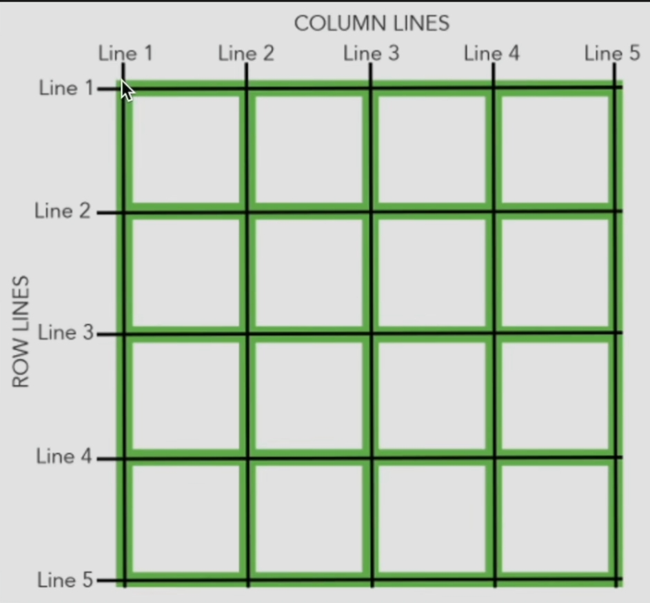
在使用线布局前,首先先参照上图和下方的代码了解一下线布局。
.container {
    grid-row-start: 1;
    grid-row-end: 3;
}
上方的代码代表container元素要占据一行两列,grid-column相关属性也是这样使用。除此之外,上面的语法可以简写为grid-row: 1/3,若这两个线相同,则可以合并为一个数字。但这样写会降低可读性。
CSS Grid使用区域名称指定布局
区域名称使用grid-template-areas属性来指定。
示例:
.container {
    display: grid;
    grid-template-areas:
        "header header"
        "sidebar ."
        "footer footer";
}
.header {
    grid-area: header;
}
...
它相当于:
.container {
    display: grid;
}

.header {
    grid-row-start: 1;
    grid-row-end: 2;
    grid-column-start: 1;
    grid-column-end: 3;
}

.sidebar {
    grid-row-start: 2;
    grid-row-end: 3;
    grid-column-start: 1;
    grid-column-end: 2;
}