
外观
界面开发 - 布局
线性布局
线性布局通过线性容器Column和Row创建。其中,Column内的元素沿垂直方向排列,Row内的元素沿水平方向排列。
线性布局 - 排列在主方向上的对齐方式
语法:.justifyContent(FlexAlign.XXX),其中XXX的可选值有:
- Start:顶部对齐,
- Center:中心对齐,
- End:底部对齐,
- SpaceBetween:第一个和最后一个元素紧贴顶部和底部,然后剩余元素在中央等距排布,
- SpaceAround:所有元素等间隔排列,非最两边的元素等距排列,最两边的元素和边隔开一半的间隔,
- SpaceEvently:所有元素和边等间隔排列。
Column({ space: 20 }) {
// Row({ space: 20 }) {
  Text("")
    .width(200)
    .height(50)
    .backgroundColor(Color.Gray)
  Text("")
    .width(200)
    .height(50)
    .backgroundColor(Color.Gray)
  Text("")
    .width(200)
    .height(50)
    .backgroundColor(Color.Gray)
}
.width('100%')
.height('100%')
.justifyContent(FlexAlign.Start)
// .justifyContent(FlexAlign.End)
// .justifyContent(FlexAlign.Center)
// .justifyContent(FlexAlign.SpaceBetween)
// .justifyContent(FlexAlign.SpaceAround)
// .justifyContent(FlexAlign.SpaceEvenly)
线性布局 - 排列在交叉轴方向上的对齐方式
交叉轴即元素在水平或垂直方向上的对齐方式,语法为.alignItems(参数),参数按照交叉轴的方向选择对应的枚举类型。
交叉轴在水平方向上使用HorizontalAlign对齐,三个枚举分别为Start、Center和End,在Column组件内使用。交叉轴在垂直方向上使用VerticalAlign对齐,三个枚举分别为Top、Center、Bottom,在Row组件内使用。
  Text("")
    .width(200)
    .height(50)
    .backgroundColor(Color.Gray)
  Text("")
    .width(200)
    .height(50)
    .backgroundColor(Color.Gray)
  Text("")
    .width(200)
    .height(50)
    .backgroundColor(Color.Gray)
}
.width('100%')
.height('100%')
.alignItems(HorizontalAlign.Start)
// .alignItems(HorizontalAlign.Center)
// .alignItems(HorizontalAlign.End)Row({ space: 20 }) {
Text("")
.width(200)
.height(50)
.backgroundColor(Color.Gray)
Text("")
.width(200)
.height(50)
.backgroundColor(Color.Gray)
Text("")
.width(200)
.height(50)
.backgroundColor(Color.Gray)
}
.width('100%')
.height('100%')
.alignItems(VerticalAlign.Top)
// .alignItems(VerticalAlign.Center)
// .alignItems(VerticalAlign.Bottom)自适应伸缩
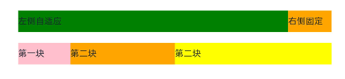
设置了自适应伸缩的子元素和兄弟元素,会按照权重分配主轴的空间。语法为.layoutWeight(数字)。
Row(){
  Text("左侧自适应")
    .layoutWeight(1)
    .height(40)
    .backgroundColor(Color.Green)
  Text("右侧固定")
    .width(80)
    .height(40)
    .backgroundColor(Color.Orange)
}

Row(){
  Text("第一块")
    .layoutWeight(1)
    .height(40)
    .backgroundColor(Color.Pink)
  Text("第二块")
    .layoutWeight(2)
    .height(40)
    .backgroundColor(Color.Orange)
  Text("第二块")
    .layoutWeight(3)
    .height(40)
    .backgroundColor(Color.Yellow)
}
弹性布局
弹性布局Flex用于让元素流式布局,它们可以具有一定的排列顺序、对齐方式,在元素超出宽度时还可以换行。弹性布局的语法为Flex(){ 组件 }
Flex() {
  Text()
    .width(100)
    .height(100)
    .backgroundColor(Color.Green)
    .border({
      color: Color.Red,
      width: 2
    })
  Text()
    .width(100)
    .height(100)
    .backgroundColor(Color.Green)
    .border({
      color: Color.Red,
      width: 2
    })
  Text()
    .width(100)
    .height(100)
    .backgroundColor(Color.Green)
    .border({
      color: Color.Red,
      width: 2
    })
}
.width(400)
.height(400)
.backgroundColor("#f1f1f1")
Flex()支持传递一个对象,里面可以定义对齐方式。
Flex({
    direction: FlexDirection.XXX,
    justifyContent: FlexAlign.XXX,
    alignItems: ItemsAlign.XXX
}) {
    组件们
}
direction的可选值有Row、Column、RowReverse、ColumnReverse,分别对应从左向右、从上到下、从右到左,从下到上排列。
justifyContent的可选值有Start、Center、End、SpaceBetween、SpaceAround、SpaceEvenly,它们的效果和线性布局对应的值效果相同。
alignItems的可选值有Auto、Start、Center、End、Baseline、Stretch。
最后一个就是Flex布局的元素若超出是否换行。若不换行则元素的宽度会自适应调节。
修改Flex布局的换行规则通过Flex传入参数对象的wrap属性更改,它的值可选为FlexWrap.NoWrap或FlexWrap.Wrap。
    Flex({
      wrap: FlexWrap.Wrap
    }) {
      Text()
        .width(100)
        .height(100)
        .backgroundColor(Color.Green)
        .border({
          color: Color.Red,
          width: 2
        })
      Text()
        .width(100)
        .height(100)
        .backgroundColor(Color.Green)
        .border({
          color: Color.Red,
          width: 2
        })
      Text()
        .width(100)
        .height(100)
        .backgroundColor(Color.Green)
        .border({
          color: Color.Red,
          width: 2
        })
      Text()
        .width(100)
        .height(100)
        .backgroundColor(Color.Green)
        .border({
          color: Color.Red,
          width: 2
        })
      Text()
        .width(100)
        .height(100)
        .backgroundColor(Color.Green)
        .border({
          color: Color.Red,
          width: 2
        })
    }
    .width(400)
    .height(400)
    .backgroundColor("#f1f1f1")
绝对定位
绝对定位可以控制组件位置实现层叠效果。它参照父组件左上角进行偏移,不再占有原来的位置。
语法:.position({ x: 水平偏移量, y: 垂直偏移量 })
Column() {
  Text()
    .width(100)
    .height(100)
    .backgroundColor(Color.Green)
    .border({
      color: Color.Red,
      width: 2
    })
  Text()
    .width(100)
    .height(100)
    .backgroundColor(Color.Orange)
    .border({
      color: Color.Red,
      width: 2
    })
    .position({
      x: 150,
      y: 150
    })
  Text()
    .width(100)
    .height(100)
    .backgroundColor(Color.Green)
    .border({
      color: Color.Red,
      width: 2
    })
}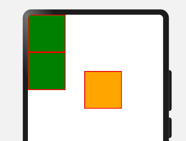
可以看到原来三个元素为顺序排列,但是加了position绝对定位之后,原来的位置已经不占了,然后相对于父元素的左上角向右向下平移。
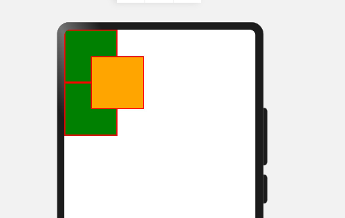
层级
若多个应用了position的组件相互覆盖,有些组件会被遮住,且这些组件的排列顺序是按照声明顺序从最顶部排列到最底部。我们可以通过使用层级显式定义组件的层级位置。
语法:.zIndex(整数)。若整数值越高,这个组件就越接近顶部。
Text()
  .width(100)
  .height(100)
  .backgroundColor(Color.Green)
  .border({
    color: Color.Red,
    width: 2
  })
Text()
  .width(100)
  .height(100)
  .backgroundColor(Color.Orange)
  .border({
    color: Color.Red,
    width: 2
  })
  .position({
    x: 50,
    y: 50
  }).zIndex(3)
Text()
  .width(100)
  .height(100)
  .backgroundColor(Color.Green)
  .border({
    color: Color.Red,
    width: 2
  })
层叠布局
绝对加层级定位可以很方便地为组件布局,但代码过多,层叠布局为我们提供了简洁的布局方式,可以更方便地使用绝对和层叠定位。
语法:Stack({ alignContent:Alignment.对齐方式 }){ 组件们 }
Stack({
    alignContent: Alignment.Center //默认值
}) {
    Text("Item1")
        .width(400)
        .height(400)
        .backgroundColor(Color.Orange)
    Text("Item2")
        .width(300)
        .height(300)
        .backgroundColor(Color.Green)
    Text("Item3")
        .width(200)
        .height(200)
        .backgroundColor(Color.Yellow)
}
.width(600)
.height(600)
.backgroundColor(Color.Pink)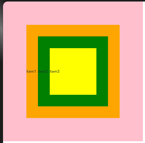
Alignment的可选值有TopStart、Top、TopEnd、Start、Center、End、BottomStart、Bottom、BottomEnd。